rendering in pure css (part 1)
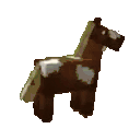
as you can tell by my website, I like minecraft horses. and ever since reading about DOOM rendered entirely with css, I have been fixated on the idea of rendering minecraft horses using just css.
it kind of makes sense. one of the browser's main jobs is rendering content. this content is more often than not declared by html and styled by css. javascript is also used for fancier things, using the canvas or webgl apis, but using html and css has a lot of desirable properties.
they are declarative languages, so there is not really internal state that you have to think about. simply producing a piece of html styled by a piece of css will draw the same pixels to the screen, no matter how that code was produced.
also, working within the framework of html and css gives you access to the rich suite of interaction that browsers already, meaning that you can do incredibly niche and cursed things with them, as you will hopefully see.
I am not an expert on graphics, and this represents the result a lot of research I've done relearning linear algebra and the basics of graphics programming. jump down to the references section to check out some of the resources I used for making this.
okay I've said enough. look at this demo, and if this doesn't scare you away, please read the rest of the post to learn how I did it.
demo
WELCOME TO MY HORSE
SLIDE THE SLIDERS TO SPIN THIS CUBE AND SEE ITS DELIGHTS
how it works
to render a complex piece of geometry, it's gotta be broken up into a bunch of triangles, and a graphics library draws those triangles to the screen. in typical graphics programming, you compile lists of coordinates representing the polygons to be rendered, plus information about how those interact with lighting, how textures map to those triangles, shaders that run arbitrary transformations against those polygons, and a lot of other fancy stuff that graphics libraries do.
for this html/css-based rendering, it's a lot simpler but also a little more complicated. the browser is not set up to render arbitrary polygons in a 3d scene, so we have to implement some part of the graphics library ourselves in the language that the browser speaks. this means creating a physical manifestation of that triangle, in this case the humble div, and manipulating the shit out of it with css transforms until it looks just about right. I had to re-learn a bunch of linear algebra for this (and a bunch of $\LaTeX$ to take notes) so y'all better LISTEN UP.
there are three principal parts to this:
- creating a triangle (this post)
- transforming the triangle into 3d space
- adding camera movement and perspective to the scene
creating a triangle
this is what it looks like to define a triangle:
<div
  class="tri"
  style="
    --a-x: 0;
    --a-y: 0;
    --a-z: 0;
    --b-x: 1;
    --b-y: 0;
    --b-z: 0;
    --c-x: 0;
    --c-y: 1;
    --c-z: 0;
  "></div>
the div is our smallest unit of three-dimensional rendering. we use css custom properties, also known as variables, to set the coordinates of the triangle. custom properties have a really nice benefit of being animatable if they're defined with the @property rule, meaning you can have fun writing pure-css animations if you're so inclined.
the goal here is to take a rectangular div, clip it into a right triangle, and then transform it so that it has the correct angle. these divs are set with position: absolute so that they are positioned at the origin, which gives the top left corner and top side of the triangle a predictable position, making future transformations simpler.
the following css clips a rectangular div into a right triangle, with the upper-left portion preserved.
.tri {
    /* position this div at the origin to start */
    /* transformations will ensure it ends up where we need it */
    position: absolute;

    /* clip rectangle to just the upper-left triangle */
    clip-path: polygon(0 0, 0 100%, 100% 0);
}
so now the div is a right triangle, but what about other triangle shapes? in order to achieve that, we'll have to skew the triangle until the angle matches. it's math time, little buddy, so lock in. look at this triangle:
the triangles rendered here have conventional points $ABC$, from which the vectors $\overrightarrow{AB}$ and $\overrightarrow{AC}$ roughly orient it right-hand rule style. we will set point $A$ is at the origin (0, 0, 0), and set $\overrightarrow{AB}$, the top leg, along the x axis. the side leg, $\overrightarrow{AC}$, stretches out somewhere into the positive Y direction (which is down by the way!!). this is what the triangle above looks like aligned in this standardized way:
and the initial triangle we will need to create, in order to transform it to that shape:
the first problem to solve is: what size should the initial div be? the triangle will be skewed along the x axis, so the points A and vector $\overrightarrow{AB}$ will be preserved, since they lie on the axis, giving us $|\overrightarrow{AB}|$ as the width of the div. since the skew will not affect the height of the shape at all, we can figure out how much of $\overrightarrow{AC}$ will be in the Y direction, and that should be the height of the div.
to calculate "figure out how much of $\overrightarrow{AC}$ will be in the Y direction", we can use the the orthogonal projection of $\overrightarrow{AC}$ from $\overrightarrow{AB}$. this works because we have defined $\overrightarrow{AB}$ to lie along the x axis, and $\overrightarrow{AC}$ to lie in the XY plane, so this orthogonal projection must lie along the Y axis. the formula for orthogonal projection is as follows:
plugging in our vectors gives us our starting dimensions and a skew amount:
and the css to do this:
.tri {
    /*
     * use AB and AC vectors to determine the height and width
     * of the containing rectangle
     */
    --delta-ab-x: calc(var(--b-x) - var(--a-x));
    --delta-ab-y: calc(var(--b-y) - var(--a-y));
    --delta-ab-z: calc(var(--b-z) - var(--a-z));

    --delta-ac-x: calc(var(--c-x) - var(--a-x));
    --delta-ac-y: calc(var(--c-y) - var(--a-y));
    --delta-ac-z: calc(var(--c-z) - var(--a-z));

    --hypot-ab: calc(hypot(var(--delta-ab-x), var(--delta-ab-y), var(--delta-ab-z)));

    /* projection of AC onto Y */
    --ac-dot-ab: calc(
        (var(--delta-ac-x) * var(--delta-ab-x)) +
        (var(--delta-ac-y) * var(--delta-ab-y)) +
        (var(--delta-ac-z) * var(--delta-ab-z))
    );
    --ac-project-ab: calc(var(--ac-dot-ab) / pow(var(--hypot-ab), 2));

    /* orthogonal projection of AC from Y */
    --tri-ac-x: calc(var(--delta-ac-x) - (var(--ac-project-ab) * var(--delta-ab-x)));
    --tri-ac-y: calc(var(--delta-ac-y) - (var(--ac-project-ab) * var(--delta-ab-y)));
    --tri-ac-z: calc(var(--delta-ac-z) - (var(--ac-project-ab) * var(--delta-ab-z)));
    --tri-height: calc(hypot(var(--tri-ac-x), var(--tri-ac-y), var(--tri-ac-z)));

    /* width and height of the initial right triangle */
    width: calc(var(--hypot-ab) * 1px);
    height: calc(var(--tri-height) * 1px);
}
and how that looks rendered:
the next thing we need is how much to skew the div along the x axis. the skew value is the amount that the $\overrightarrow{AC}$ must shift in the x axis, that is, in the direction of $\overrightarrow{AB}$, over the course of its height. see the shear affine transformation here for more details. the transformation to do the skewing is thus:
this ensures that at the full height of the div, it is fully skewed to the point it should be.
with this math, we can begin writing the basic css to give us a triangle-shaped div with the correct shape:
.tri {
    /* calculate the skew matrix coefficient */
    --skew-ac-x: calc(var(--ac-project-ab) * var(--delta-ab-x));
    --skew-ac-y: calc(var(--ac-project-ab) * var(--delta-ab-y));
    --skew-ac-z: calc(var(--ac-project-ab) * var(--delta-ab-z));
    --skew-length: calc(hypot(var(--skew-ac-x), var(--skew-ac-y), var(--skew-ac-z)));
    --skew-coefficient: calc(var(--skew-length) / var(--tri-height));

    /* Z basis vector, formed from the normalized cross product of the X and Y basis vectors */
    transform-origin: 0% 0%;
    transform:
        matrix3d(
            1, 0, 0, 0,
            var(--skew-coefficient), 1, 0, 0,
            0, 0, 1, 0,
            0, 0, 0, 1
        );
    }
you might notice that the skew coefficient swapped around in the transformation matrix from how it was defined above: that's because the matrices in css are column-major, which from what I can understand is common in graphics programming. this just means that the visual representation ends up looking like the matrix is transposed. the more you know...
with that all set up, we have step one done! there is a triangle, and it looks like the triange we want. the only problem is that it's stuck in the XY plane, staring at us, taunting us.
and that's part 1! there will be more coming in the future, covering the transformation of our triangles into three-dimensional space, camera rotation, perspective transformation, texturing (still figuring this one out), and animation.
those will be linked here when they're out!
references
scratchapixel - The Perspective and Orthographic Projection Matrix - a great introduction to the concepts behind perspective transformation. I still don't fully get it but this got me a little closer. it looks like there are a bunch of other great posts here about graphics programming basics, so I'm excited to dive deeper here as I work more on this project
Wikipedia - Rotation matrix - I kinda just stole the general 3d rotation matrix from here without thinking too hard about that. I hope that's okay.
Niels Leenheer - CSS is DOOMed - obviously. this is what inspired my fascination with this whole things